Transformation Series | Volume III
Audrey Healey • Apr 22, 2020
Volume III | The Guest Suite


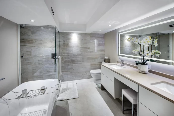
Two days ago, you embarked on a virtual tour of a renovation transformation. After exploring the fundamentals of the great room and the functionality of the den, the next stop is the guest suite. Requiring nothing more than a facelift, the guest suite was one of the less demanding areas of the transformation. The focus revolved around three elements: carpentry, color, and comfort. Simple in concept but significant in impact, these elements may come in handy if you, too, are looking for a refresh.
Carpentry was the first area of focus. Prior to the renovation, the eye was naturally drawn to the yellowing interior doors and coordinating baseboards. Without hesitation, the client opted to replace all doors and baseboards with a cleaner alternative. Though electing for replacement can be exciting, remember that a simple repaint can often make a substantial impact. This is especially useful to keep in mind when working with a tight budget!
The next focus was color. The existing wallcovering/paint color combination was less than appealing. Luckily, just as the spaces previously shared, palette adjustment alone had the potential to make a large impact. Consistency was a goal throughout the entire unit, so it should come as no surprise the same neutral palette was carried into both the guest bathroom and the guest bedroom. A soothing palette can elevate nearly any space!
Finally, being that this was a guest suite, comfort was a vital area of focus. Because the room rarely housed children, it was important to furnish accordingly. It was time to upgrade both the sleeping arrangements and storage accommodations. Soft, warm textures were selected in an effort to emulate a dreamy oasis for guests. If you’re ready for a similar upgrade, be sure to opt for comfort so you can enjoy your selections for years to come.
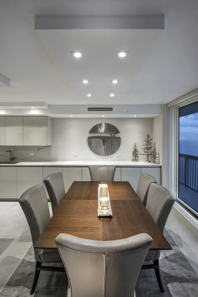
Check in with us tomorrow as we continue this journey into the dining room!
By Audrey Healey

